
Gym Clothing Brand Logo Ideas: Creative Designs to Stand Out
Creating a gym clothing brand is about more than just fabrics and fits—it’s about identity. The logo you choose becomes the face of your brand, showing your values, style, and energy. For gym clothing brands, a logo must be bold, memorable, and instantly recognizable.
It should appeal to fitness lovers, inspire confidence, and look great on every product, from shirts to water bottles.
Choosing the right logo can make a small brand stand out or help a large one stay fresh. Many new gym brands struggle with logo design, but a smart logo can create loyal customers and build a strong community. In this guide, you’ll discover creative and practical ideas for gym clothing brand logos, learn how to design them, and see what makes a logo work in the fitness world.
Why Gym Clothing Brand Logos Matter
A logo is more than just an image or text. It’s a powerful tool that connects your brand to your customers. Gym clothing brands need logos that:
- Communicate energy and motivation
- Show quality and trust
- Stand out in a crowded market
- Look good on all products and platforms
For fitness brands, the logo often appears everywhere: on apparel, social media, gym bags, and even sponsorship banners. A weak logo can be forgotten, but a strong logo builds recognition. In fact, research shows that brands with memorable logos are 13% more likely to attract repeat customers.
Elements Of A Great Gym Clothing Logo
Before diving into ideas, it helps to understand what makes a gym logo effective. Here are the key elements:
1. Simplicity
Simple logos are easier to recognize and reproduce. They look sharp on clothing tags, embroidery, and small surfaces.
2. Boldness
Gym brands often use strong shapes and thick lines. Bold logos communicate strength and confidence.
3. Versatility
Your logo should look good in color and black-and-white, on large banners or tiny tags.
4. Relevant Imagery
Use symbols that represent fitness: weights, muscles, motion, or abstract shapes that suggest energy.
5. Unique Typography
Custom fonts or clever lettering can help your logo stand out.
6. Color Psychology
Colors affect how people feel. Reds and oranges suggest action; blues and greens feel calm and healthy.
7. Scalability
A logo must be readable and clear, whether it’s on a website or a workout shirt.

Credit: www.designcrowd.com
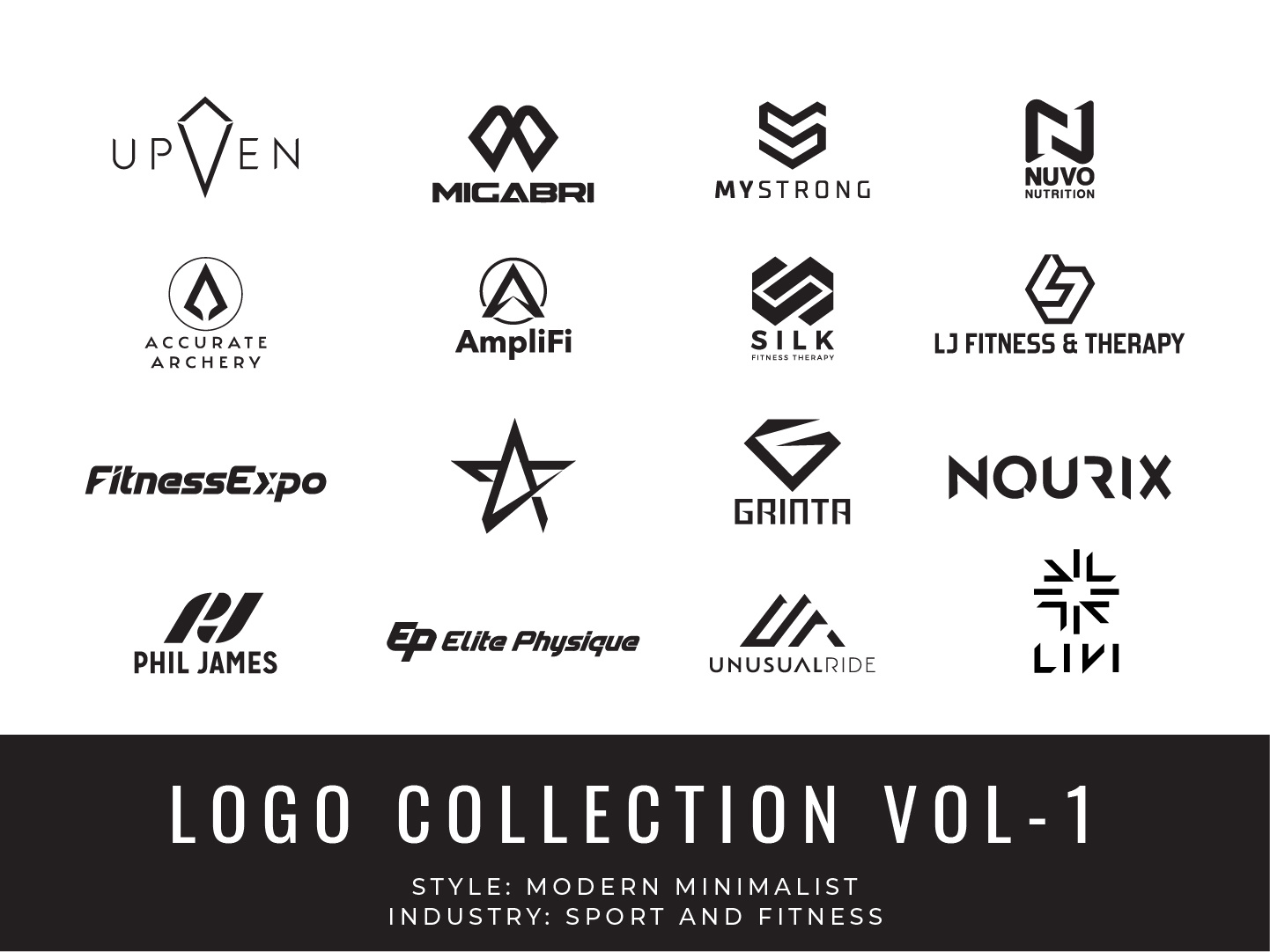
Gym Clothing Brand Logo Ideas
Here are creative and practical ideas for gym clothing brand logos, with explanations and examples to spark inspiration.
1. Minimalist Monogram
Use the initials of your brand in a clean, bold style.
Example: If your brand is “FitForce,” combine the letters “F” and “F” in a unique shape. This kind of logo looks modern and professional.
Why it works:
Monograms are easy to remember and print. They don’t distract from your clothing designs and make your brand look high-end.
2. Abstract Muscle Symbol
Design a logo using abstract lines or shapes that suggest muscle or movement.
Example: Curved lines forming a bicep or flexing arm, but without detailed illustration.
Why it works:
Abstract logos are timeless and can appeal to both men and women. They suggest strength without being too literal.
3. Geometric Shapes
Simple geometric shapes (triangles, circles, squares) can represent stability or energy.
Example: A triangle pointing upward symbolizes progress and growth.
Why it works:
Geometric logos are easy to scale and look good on clothing labels. They are also easy to recognize at a distance.
4. Animal Motifs
Choose an animal that represents your brand’s energy.
Example: A lion for strength, a wolf for teamwork, or a panther for agility.
Why it works:
Animal logos are popular because they communicate personality. Many gym brands use animal symbols to inspire customers.
5. Fitness Equipment Icons
Use simple illustrations of gym equipment.
Example: Dumbbells, kettlebells, barbells, or jump ropes.
Why it works:
These logos are instantly recognizable and connect directly to fitness. They are perfect for brands focused on strength training.
6. Dynamic Lettering
Create a logo using letters in motion or with creative effects.
Example: Letters that look like they are running, jumping, or lifting.
Why it works:
Motion in lettering shows energy and action. It makes your brand feel lively and active.
7. Shield Or Crest
A shield design suggests protection, strength, and tradition.
Example: A shield with your brand initials and a subtle fitness symbol.
Why it works:
Crests and shields make your brand feel established and trustworthy. They work well for both premium and budget brands.
8. Inspirational Slogans
Combine a short slogan with a simple icon.
Example: “Rise Strong” with a rising sun or upward arrow.
Why it works:
Slogans add meaning to your logo. They motivate customers and build loyalty.
9. Circular Badge
Create a circular logo with your brand name and a symbol.
Example: A circle with “FitGear” and a small dumbbell inside.
Why it works:
Circular logos look great on patches, stickers, and shirt tags. They are easy to print and scale.
10. Abstract Energy Lines
Use sharp or flowing lines to suggest movement and energy.
Example: Zig-zag or wave shapes around your initials.
Why it works:
Lines make your logo feel dynamic. They are simple but add visual interest.
11. Iconic Mascot
Design a cartoon mascot for your brand.
Example: A muscular bear lifting weights.
Why it works:
Mascots are fun and memorable. They appeal to younger customers and make your brand feel friendly.
12. Vintage Style
Use retro fonts and symbols for a classic gym look.
Example: Old-school dumbbell with bold, block letters.
Why it works:
Vintage logos appeal to nostalgia. They are popular for brands that want to feel authentic and reliable.
13. Nature-inspired
Combine fitness with natural elements.
Example: Leaves, mountains, or water drops with your brand name.
Why it works:
Nature-inspired logos connect fitness with health and wellness. They are perfect for eco-friendly or yoga brands.
14. Negative Space
Design a logo where the shape is created by empty space.
Example: A dumbbell formed by negative space between two letters.
Why it works:
Negative space logos are clever and memorable. They show creativity and skill.
15. Combination Mark
Mix a symbol with your brand name.
Example: A small icon next to bold text.
Why it works:
Combination marks are flexible. You can use the symbol alone or with text, depending on the product.
16. Custom Fonts
Create a logo using a unique, hand-designed font.
Example: Letters with sharp angles or curves.
Why it works:
Custom fonts give your brand a unique feel. They set you apart from brands using generic fonts.
17. Motivational Imagery
Use symbols like arrows, mountains, or steps to show progress.
Example: An arrow moving upward beside your brand name.
Why it works:
Motivational images inspire customers. They communicate growth and achievement.
18. Urban Style
Design with street art or graffiti elements.
Example: Spray paint effect or bold, colorful shapes.
Why it works:
Urban logos appeal to younger, trendy customers. They make your brand feel energetic and cool.
19. Tech-inspired
Use digital or futuristic shapes.
Example: Pixelated letters or circuit board patterns.
Why it works:
Tech-inspired logos are good for brands with smart fabrics or digital fitness products.
20. Icon Grid
Place several small icons in a grid.
Example: Dumbbell, sneaker, water bottle, and yoga mat.
Why it works:
Icon grids show your brand’s range and versatility. They can be used as a pattern or badge.
Comparing Logo Types: What Works Best?
Each logo idea fits a different brand style. To help you decide, here’s a comparison of three popular types:
| Logo Style | Best For | Strengths | Weaknesses |
|---|---|---|---|
| Monogram | Premium, minimal brands | Easy to print, professional look | May lack personality |
| Animal Motif | Energetic, bold brands | Memorable, emotional appeal | Can seem childish if not designed well |
| Fitness Equipment Icon | Direct, strength-focused brands | Instant recognition, clear message | Can be too common, less unique |
Color Choices For Gym Clothing Logos
Color is one of the most important parts of logo design. It affects mood, attracts attention, and helps your brand stand out. Here are popular color choices for gym logos:
- Black: Power, elegance, simplicity
- Red: Energy, passion, action
- Blue: Trust, calm, reliability
- Orange: Motivation, creativity, youth
- Green: Health, growth, natural
Some brands use two or three colors for extra impact. For example, black and red are popular for hardcore gym brands, while blue and green suit wellness-focused brands.
Color Comparison Table
Here’s a side-by-side look at how colors affect gym clothing logo perception:
| Color | Emotion | Best For | Tips |
|---|---|---|---|
| Black | Strength, sophistication | Luxury, minimal brands | Use for simple, bold logos |
| Red | Excitement, action | High-energy brands | Pair with white or black for impact |
| Blue | Calm, trust | Wellness, yoga brands | Use light blues for softness |
| Orange | Fun, creativity | Youth-focused brands | Combine with neutral colors |
| Green | Health, freshness | Eco-friendly brands | Use with earth tones |
Typography: Choosing The Right Font
Fonts are just as important as symbols and colors. Here’s what to consider for gym clothing logos:
- Bold fonts: Show strength and confidence
- Sans-serif fonts: Look modern and clean
- Handwritten fonts: Feel personal and unique
- Block letters: Easy to read at any size
Avoid fonts that are too thin or fancy—they can be hard to read on clothing. Many brands create custom fonts to stand out.
Placement: Where Your Logo Will Appear
A gym clothing brand logo isn’t just for your website. It needs to look good everywhere:
- T-shirts: Chest, sleeve, back
- Shorts and leggings: Hip, thigh, waistband
- Accessories: Bags, hats, water bottles
- Social media: Profile photos, banners
Think about each placement when designing your logo. Some logos need a horizontal version and a stacked (vertical) version for flexibility.
Logo Design Process: Steps To Success
Designing a logo isn’t just about drawing. It’s a step-by-step process:
1. Research Competitors
Look at what works and what doesn’t in your market.
2. Define Your Brand Personality
Are you tough and bold, or calm and supportive? This affects every design choice.
3. Sketch Ideas
Start with rough sketches. Try different shapes, fonts, and symbols.
4. Choose Colors And Fonts
Pick colors and fonts that match your brand style.
5. Test Scalability
Make sure your logo looks good small and large.
6. Get Feedback
Show your logo to friends, customers, or designers.
7. Finalize And Adapt
Create different versions for products, social media, and marketing.
Real Examples: Gym Clothing Brand Logos
Looking at real logos can inspire your own. Here are some well-known gym clothing brands and what makes their logos effective:
- Nike: The simple swoosh shows movement and victory. It works on every product, from shirts to shoes.
- Under Armour: The bold, symmetrical logo looks powerful and modern.
- Gymshark: The shark symbol is unique and connects to strength and agility.
Many smaller brands use simple icons, bold fonts, and clever combinations to make their mark. For example, “Alphalete” uses stylized letters with a wolf motif, showing both leadership and energy.
Common Logo Mistakes To Avoid
Even good ideas can go wrong. Here are mistakes to avoid:
- Too complicated: Complex logos don’t print well and are hard to remember.
- Copying others: Your logo should be unique. Avoid designs that look like famous brands.
- Poor color choices: Colors that clash or fade on fabrics hurt your brand.
- Hard-to-read fonts: Fancy fonts can make your logo unreadable.
- Ignoring scalability: If your logo doesn’t look good at small sizes, it won’t work on tags or accessories.
- Not testing on products: Always check how your logo looks on real clothing.
Tips For Creating Your Own Gym Clothing Logo
If you’re ready to design your logo, here are practical tips:
- Keep it simple: Start with basic shapes and add detail only if needed.
- Use inspiration boards: Collect logos you like and note what works.
- Try different color combinations: Test on different backgrounds.
- Ask for feedback: Don’t rely only on your own opinion.
- Hire a designer if needed: Professional designers can help turn your idea into a polished logo.
How To Stand Out: Non-obvious Logo Insights
Many beginners miss these important points:
1. Test The Logo On Different Materials
A logo might look great on paper but fade or distort on fabric. Always test on samples before finalizing.
2. Think About Emotional Impact
Your logo should make people feel something—motivated, strong, or welcomed. A logo that feels cold or generic won’t build loyalty.
3. Adapt For Global Audiences
If you plan to sell worldwide, check that your logo doesn’t have negative meanings in other cultures or languages.
4. Use Feedback From Real Customers
Designers and friends may like your logo, but your target customers matter most.
5. Plan For Future Growth
Choose a logo that can evolve as your brand expands. Avoid designs tied to one product or trend.
Logo Design Tools And Resources
There are many tools to help you create logos:
- Canva: Simple online design tool for beginners.
- Adobe Illustrator: Professional software for detailed design.
- LogoMakr: Easy logo creation for small brands.
- Fiverr or Upwork: Hire freelance designers if you need expert help.
You can also find inspiration and best practices from sites like Behance, which showcases creative logos from around the world.
Pricing And Costs: What To Expect
Logo design can cost anywhere from $20 to $2000, depending on your needs:
- DIY online tools: $20–$100
- Freelance designers: $100–$500
- Professional agencies: $500–$2000
Cheaper options are good for small brands starting out. But investing in a professional logo pays off in the long run.
Logo Cost Comparison Table
Here’s a quick look at what you get for different budgets:
| Option | Cost Range | Features | Best For |
|---|---|---|---|
| Online tools | $20–$100 | Templates, quick edits | Startups, low budget |
| Freelancers | $100–$500 | Custom designs, revisions | Growing brands |
| Agencies | $500–$2000 | Full branding, expert advice | Established brands |
Credit: 99designs.com
Branding Beyond The Logo
Your logo is just one piece of your brand. To build a strong identity:
- Create a style guide: Set rules for colors, fonts, and logo use.
- Use consistent messaging: Make sure your logo fits your brand voice.
- Build a community: Use your logo to unite customers through events, challenges, and social media.
- Adapt your logo for trends: Update colors or shapes as fashion changes, but keep your core design.
Frequently Asked Questions
What Makes A Gym Clothing Brand Logo Unique?
A unique logo uses custom shapes, fonts, or symbols that are not copied from other brands. It matches your brand’s personality and stands out in the fitness market. Unique logos are memorable and help customers feel connected.
How Can I Test If My Logo Works?
Print your logo on sample clothing, tags, and accessories. Show it to your target customers and ask for honest feedback. Check if it looks good at different sizes and on different backgrounds.
Which Colors Are Best For Gym Clothing Logos?
Popular colors are black (strength), red (energy), blue (trust), and green (health). The best color depends on your brand personality. Test combinations to see what fits your products and audience.
Should I Use A Symbol Or Just Text For My Logo?
Symbols add visual interest and can make your logo more recognizable. Text-only logos are simple and easy to read. Many brands use a combination mark (symbol plus text) for flexibility.
Can I Change My Logo Later?
Yes, brands often update their logos to stay fresh or match new products. Small changes are safer, but big changes can confuse customers. Plan updates carefully and communicate them clearly.
Choosing the right gym clothing brand logo is a journey. With the right ideas, tools, and insights, you can create a logo that inspires, attracts, and grows your brand. Take your time, test on real products, and listen to your customers.
A great logo is the foundation of your brand’s success—make it count.
Credit: dribbble.com