
Graphic Designs for Tees: Creative Ideas to Boost Your Brand
Graphic Designs for Tees: Complete Guide to Creating Eye-Catching T-Shirt Art
A t-shirt is more than just a piece of clothing. It's a way to express personality, share a message, or represent a brand. The secret behind a t-shirt people love to wear is often the graphic design on its front. Whether you're an artist, a small business owner, or just curious about graphic designs for tees, this guide will show you everything you need to know to create, choose, and sell t-shirt graphics that stand out.
The world of t-shirt graphics is always evolving. Trends come and go, but some design principles stay the same. Many people believe a good idea is enough, but execution matters even more. From simple logos to complex illustrations, each element plays a role in making your tee memorable.
Let's explore the essential elements, techniques, and tips for creating t-shirt designs that people actually want to wear.
What Makes A Great Tee Graphic?
T-shirt designs are everywhere, but only a few catch your eye. So, what separates the best from the rest?
1. Clarity and Simplicity
A great tee graphic communicates its message quickly. If someone can understand your design in two seconds, you're on the right track. Complex designs might look good up close, but from a distance, they can get lost. Always start with a clear idea and remove anything unnecessary.
2. Strong Visual Impact
Bold colors, strong lines, and balanced composition help your design pop. High-contrast graphics stand out on most t-shirt colors. For example, a white print on a black shirt draws immediate attention.
3. Originality and Creativity
Copying trends can work, but unique ideas last longer. Think about what makes your design different from others. Maybe it's a twist on a popular theme, or an inside joke only your target audience understands.
4. Wearability
A design might look great on a screen but awkward on a shirt. Always visualize how the graphic sits on the fabric. Will someone feel comfortable wearing this to the store, school, or an event?
5. Technical Quality
Poor resolution, jagged lines, or bad color choices can ruin even the best concepts. Make sure your design is high-resolution (usually 300 DPI for printing) and uses colors that print well.
Types Of Tee Graphics
There are many different styles of t-shirt graphics. Each style has its own audience and purpose.
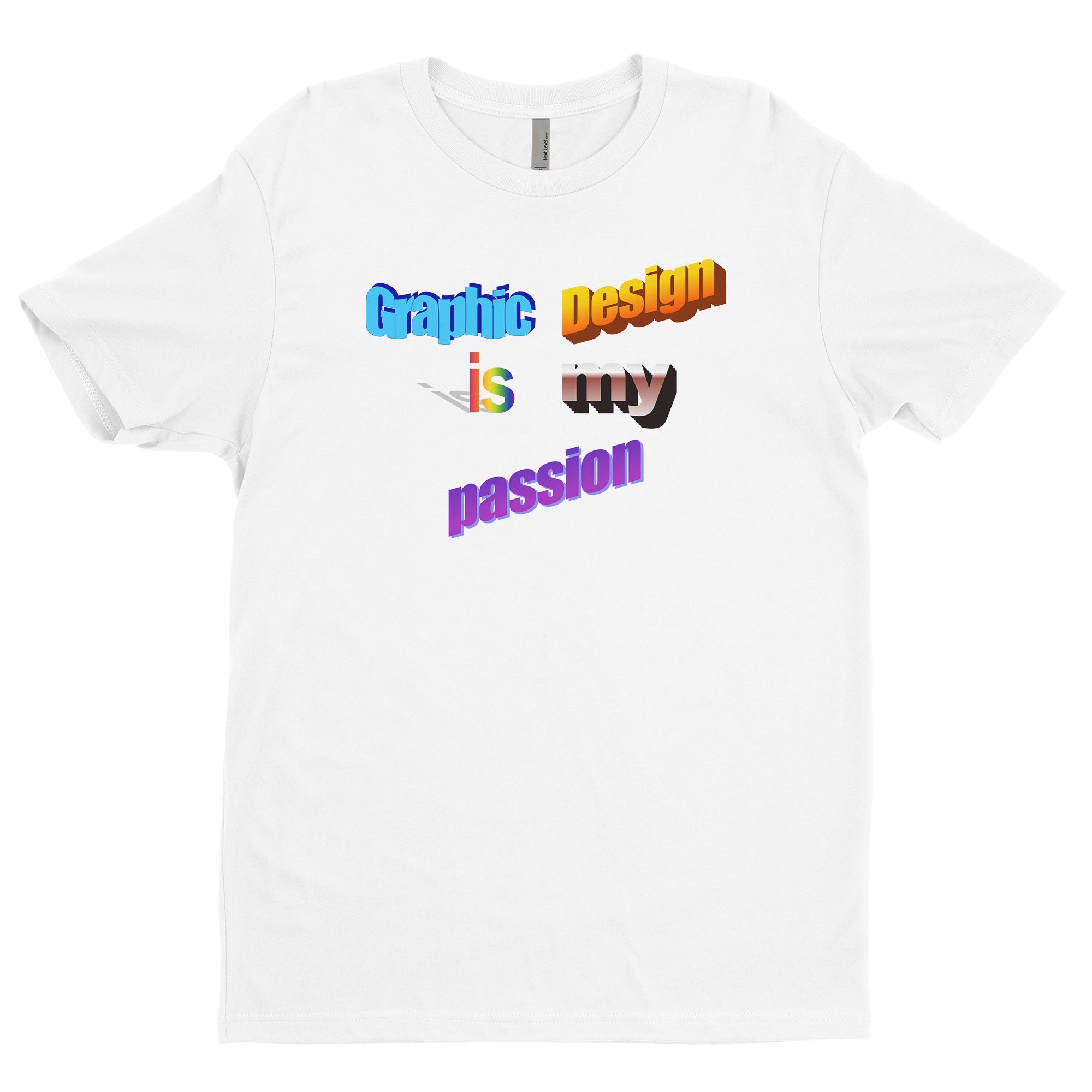
1. Text-based Designs
Simple and powerful, text-based designs use words as the main feature. Slogans, quotes, and single words can be strong statements. The choice of font, letter spacing, and alignment makes a huge difference. For example, a bold sans-serif font creates a modern feel, while handwritten fonts add a personal touch.
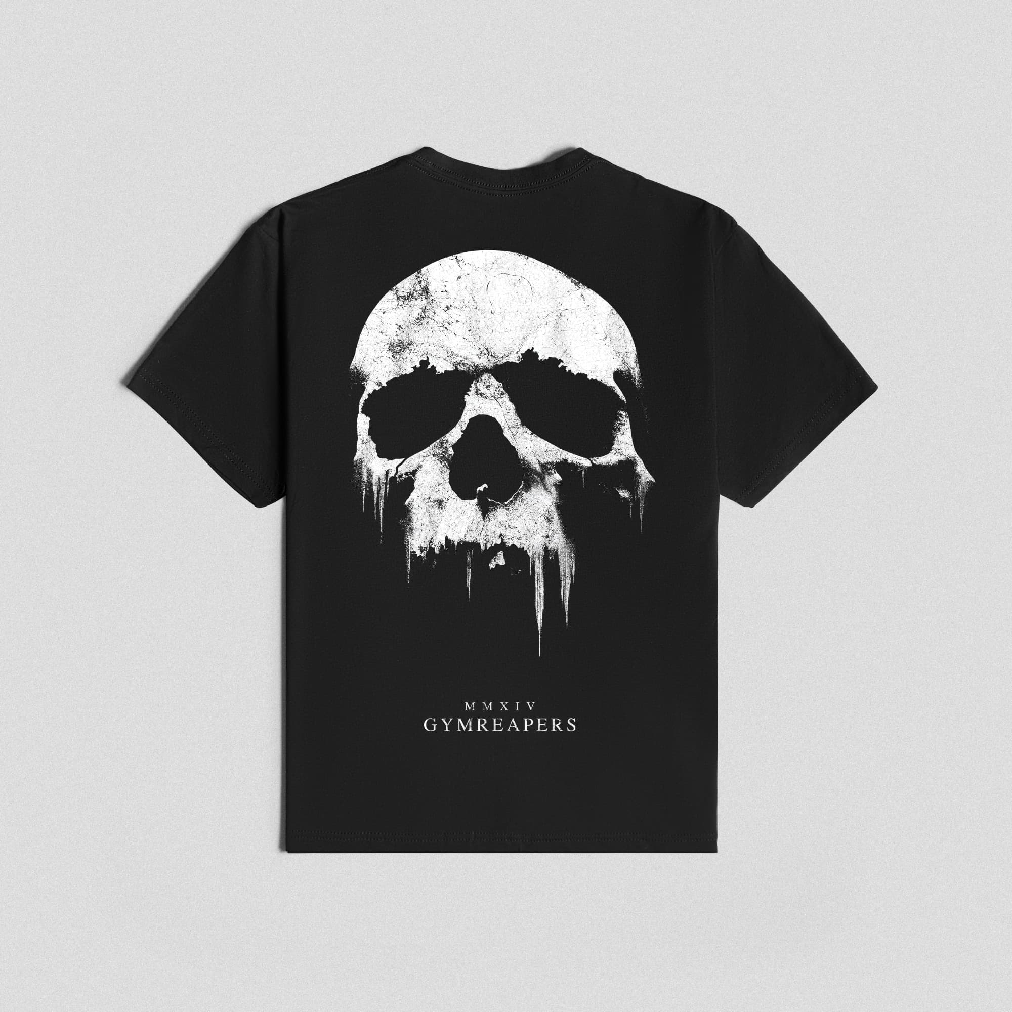
2. Illustrative Designs
Illustrative designs rely on hand-drawn or digital illustrations. These can be cartoonish, realistic, or abstract. Illustrative tees are popular with artists and brands that want to show off their creativity.
3. Logo And Minimalist Graphics
Logos or minimal graphics use simple shapes or brand marks. They are often small and placed on the chest or sleeve. Minimalist tees are timeless and go well with most outfits.
4. All-over Prints
Unlike a small chest graphic, all-over prints cover the whole shirt. These require special printing techniques and are often used for patterns, landscapes, or large illustrations.
5. Photographic Designs
High-quality photos can be used as t-shirt graphics. These often include cityscapes, portraits, or nature shots. The key is using high-resolution images that translate well to fabric.
6. Retro And Vintage Styles
Retro graphics use old-school fonts, faded colors, and classic themes. They appeal to nostalgia and are popular in fashion cycles.
7. Parody And Meme Tees
A funny twist on a famous logo or meme can go viral. But be careful: copyright issues can arise if you copy too closely.
8. Artistic And Abstract Art
Some tees feature abstract art or painterly effects. These are popular in art communities and among people who want something more expressive.

Credit: www.youtube.com
Design Process: Step By Step
Creating a t-shirt graphic is more than just drawing. It involves several steps to get from idea to finished shirt.
1. Research And Inspiration
Start by looking at what’s already out there. Explore online stores, fashion magazines, or social media. Notice what works and what doesn’t. But don’t just copy—use these ideas as a springboard.
2. Brainstorming And Sketching
Begin by sketching rough ideas on paper or a tablet. Don’t focus on details yet. Try different layouts, fonts, and icons. Some designers use mind-maps or word associations to spark ideas.
3. Choosing Colors
Pick a color palette that matches your theme. If you’re designing for printing, stick to colors that work well on fabric. Avoid using too many shades, as each color can increase print costs.
4. Selecting Fonts
If your design includes text, choose fonts carefully. Use no more than two fonts per design to keep things balanced. Test how they look on both light and dark backgrounds.
5. Creating The Digital File
Use design software like Adobe Illustrator or free tools like Canva or GIMP. Make sure your file is high-resolution (at least 300 DPI) and uses vector graphics when possible. This keeps your design sharp at any size.
6. Mockups And Testing
Place your design on a t-shirt template (mockup). This helps you see how it looks in real life. Show it to friends or potential buyers and get feedback.
7. Preparing For Print
Convert your design to the right file format (often PNG with a transparent background). Check with your printer for specific requirements. Some printers need vector files (SVG, AI), while others accept high-res raster images.
Insider Tip: Many beginners forget to check how their design looks on different shirt colors. Always test your graphic on both light and dark backgrounds, as contrast can change the design’s visibility.
Printing Methods For T-shirt Graphics
How your graphic is printed matters as much as the design itself. Different methods offer different results.
1. Screen Printing
Screen printing is the oldest and most popular method. It uses mesh screens to push ink onto the fabric. It’s best for large orders and simple designs with a few colors.
Pros:
- Durable and vibrant colors
- Cost-effective for bulk orders
Cons:
- Expensive for small runs
- Not ideal for complex, multicolor images
2. Direct-to-garment (dtg)
DTG printing works like an inkjet printer for shirts. It prints the design directly onto the fabric.
Pros:
- Great for complex images and small batches
- No color limitations
Cons:
- Colors may fade over time
- Works best on 100% cotton shirts
3. Heat Transfer
Heat transfer uses a special paper to transfer the design onto the shirt with heat and pressure.
Pros:
- Good for detailed images and small orders
- Can include photos or gradients
Cons:
- Less durable after many washes
- May feel heavy or “plastic” on the shirt
4. Sublimation
Sublimation printing turns ink into gas, which bonds with polyester fibers. It’s used for all-over prints or designs on light synthetic fabrics.
Pros:
- Soft feel, design becomes part of the fabric
- Great for vibrant, full-color prints
Cons:
- Only works on polyester or blends
- Not for dark shirts
5. Embroidery
Not a print method, but embroidery uses thread to sew the design onto the shirt. It’s common for logos or small graphics.
Pros:
- Very durable
- High-end look
Cons:
- Limited detail and color
- Not suitable for large or complex designs
Printing Methods Comparison
Here’s a quick comparison of the main printing methods:
| Printing Method | Best For | Pros | Cons |
|---|---|---|---|
| Screen Printing | Bulk, simple designs | Durable, vibrant colors | Expensive for small runs |
| DTG | Complex, small orders | Full color, detailed | Less durable, best on cotton |
| Heat Transfer | Photos, gradients | Versatile, detailed | May fade, feels heavy |
| Sublimation | All-over, polyester | Soft, vibrant colors | Not for dark/cotton shirts |
| Embroidery | Logos, small graphics | Durable, premium look | Not for big or detailed art |
Choosing The Right Tee For Your Design
Not all t-shirts are created equal. The type of shirt you use can make or break your design.
Fabric Types
- Cotton: Soft, breathable, and works with all print methods.
- Polyester: Used for athletic wear and sublimation printing.
- Blends: Mixes cotton, polyester, or rayon. Comfortable and versatile.
Fit And Style
T-shirts come in many cuts: classic, fitted, relaxed, longline, cropped, and more. The style affects how the graphic sits on the body.
Color Choices
Some designs look better on dark shirts; others pop on light backgrounds. Always order a test print to see the final result.
Size Range
If you’re selling tees, offering a wide range of sizes ensures more people can wear your designs.
Shirt Quality Comparison
Here’s a simple comparison:
| Shirt Type | Print Compatibility | Comfort | Durability |
|---|---|---|---|
| 100% Cotton | All methods | High | High |
| Polyester | Sublimation, Heat Transfer | Medium | Very High |
| Blend (Cotton/Poly) | Most methods | High | High |
Color Theory For T-shirt Graphics
Choosing the right colors is essential for t-shirt designs. Bad color choices can make a design hard to read or unattractive.
Basic Color Tips
- Use contrasting colors for text and background.
- Limit your palette to 2–4 main colors for clarity.
- Test colors on both light and dark shirts.
Color Psychology
Different colors create different moods:
- Red: Energy, attention
- Blue: Calm, trust
- Green: Nature, growth
- Yellow: Happiness, youth
- Black/White: Timeless, versatile
Pantone And Spot Colors
If you want exact color matches (for brands), use Pantone colors. For most projects, RGB or CMYK is fine, but Pantone ensures consistency across batches.
Overlooked Insight: Many beginners ignore how skin tone interacts with shirt color. For example, light yellow shirts may not look good on every skin tone. Always consider your audience.
Sizing And Placement Of Graphics
Where you place the graphic on the shirt is as important as the design itself.
Standard Placements
- Center Chest: Most common, balanced look.
- Left/Right Chest: For logos or small graphics.
- Full Front/Back: For large, bold statements.
- Sleeves: Subtle branding or small icons.
Sizing Tips
- Main chest graphics: 9–12 inches wide
- Small logos: 3–4 inches wide
- All-over: Matches shirt size
Always check with your printer for their specific recommendations.
Placement Mistakes To Avoid
- Placing designs too high or low on the chest
- Graphics that wrap under the arms (can distort image)
- Designs too close to collar or seams
Insider Tip: Print your graphic on paper, cut it out, and tape it to a shirt. This helps visualize final placement before printing.
Trends In Tee Graphic Design
Fashion and design trends change, but some themes keep coming back. Here’s what’s popular in t-shirt graphics:
Minimalism
Simple, clean designs with lots of empty space. These are easy to wear with anything.
Bold Typography
Large, clear fonts that make a statement. Common for slogans or activist tees.
Retro And Vintage
Old-school graphics, faded colors, and classic logos. Appeals to nostalgia.
Nature And Outdoors
Mountains, trees, animals—anything that connects with outdoor lovers.
Pop Culture And Memes
References to movies, TV, games, or internet jokes.
Hand-drawn Elements
Imperfect lines and hand-drawn art add a personal touch.
Abstract And Artistic
Splashy colors, geometric shapes, and expressive brushwork.
Customizable Designs
Some brands let customers add their name or choose colors.
Social And Political Messages
Tees as a platform for activism or awareness.
Collaboration Designs
Artists partner with brands for unique, limited-edition graphics.
Non-obvious insight: Trends can change quickly, but timeless designs (like simple logos or classic art) keep selling year after year. It’s smart to mix trend-driven and evergreen designs in your collection.
Common Mistakes In Tee Graphic Design
Even experienced designers make mistakes. Here are pitfalls to avoid:
1. Ignoring the Shirt Color
A design that looks great on white may disappear on black. Always test your graphic on different shirt colors.
2. Using Too Many Fonts
Mixing more than two fonts creates a messy look.
3. Overcrowding the Design
Less is often more. Give your graphic space to breathe.
4. Poor Quality Images
Low-resolution files lead to blurry prints. Always design at high resolution.
5. Bad Placement
Graphics too high, low, or off-center look unprofessional.
6. Not Considering Audience
A joke or reference that works for one group may confuse others.
7. Copyright Infringement
Using copyrighted images or logos without permission can get you in trouble.
Selling Tees With Your Designs
If you want to sell your t-shirt graphics, there are several ways to get started.
Print-on-demand Services
Platforms like Printful, Teespring, or Redbubble let you upload your design and sell shirts without buying inventory. They handle printing, shipping, and customer service.
Pros:
- No upfront costs
- Easy to test ideas
Cons:
- Lower profit per shirt
- Less control over quality
Bulk Printing And Inventory
Order shirts in bulk from a local printer, then sell through your website or at events.
Pros:
- Higher profits per shirt
- Control over materials and quality
Cons:
- Upfront costs
- Need to manage inventory
Online Marketplaces
Sites like Etsy or Amazon let you reach a wide audience. You can sell your shirts or even just your graphics for others to print.
Social Media And Marketing
Use Instagram, TikTok, or Facebook to showcase your designs. Great photos and videos increase sales.
Pro Tip: Always order samples before selling to customers. This lets you check print quality and fit.
Legal Tips For Tee Graphics
Copyright and trademark issues are common in t-shirt design.
- Only use artwork you create or buy the rights to.
- Avoid using trademarked logos, characters, or phrases.
- Consider registering your original designs for copyright protection.
- If you hire a designer, make sure you get full rights to the art.
For more, check out the U.S. Copyright Office.
Real-world Examples And Case Studies
Example 1: Slogan Tee That Went Viral
A simple tee with the phrase "But First, Coffee" became a best-seller. Why? The message was clear, relatable, and used a modern font. It worked across many shirt colors.
Example 2: Local Artist Collaboration
A small brand partnered with a local artist to create hand-drawn animal designs. They used limited runs and promoted on Instagram. The exclusivity and personal story helped sales.
Example 3: All-over Print Success
A nature-themed brand used sublimation to print a full landscape on polyester shirts. Their unique style stood out at outdoor festivals.
Example 4: Minimalist Logo Brand
A startup launched with just a simple geometric logo on soft, high-quality tees. The minimalist look made the shirt versatile, and they built a loyal customer base.
Example 5: Customizable Team Tees
A sports club offered custom shirts where buyers could add their name and number. This personalized touch increased demand.
Credit: www.tb4a.com
Tools And Resources For T-shirt Designers
- Adobe Illustrator: Industry standard for vector graphics
- Photoshop: Great for raster art and photo-based designs
- Canva: User-friendly, perfect for beginners
- Procreate: Top app for digital illustration (iPad)
- Mockup Generators: Placeit, Smartmockups for realistic previews
- Pantone Color Finder: For exact color matches
Hidden Insight: Many designers overlook using mockup generators. Seeing your design on a realistic shirt (not just a flat template) helps catch mistakes early.
Frequently Asked Questions
What Is The Best Resolution For T-shirt Graphics?
Aim for at least 300 DPI (dots per inch) at the final print size. This ensures your design is crisp and clear. Vector files (like SVG or AI) are even better, as they can scale to any size without losing quality.
Can I Use Any Image For My T-shirt Design?
No. You must use original artwork or images you have permission to use. Using copyrighted or trademarked images without permission can lead to legal problems.
What Colors Print Best On T-shirts?
High-contrast colors work best. White or light ink on dark shirts and dark ink on light shirts usually give the clearest results. Always test print samples to see the final look.
How Do I Choose The Right Size For My Tee Graphic?
Standard chest designs are usually 9–12 inches wide. Small logos for the chest or sleeve are about 3–4 inches. Always check with your printer, as different shirt sizes may need adjustments.
What’s The Difference Between Screen Printing And Dtg?
Screen printing is best for simple, bulk designs and is very durable. DTG (Direct-to-Garment) is great for detailed, full-color designs and small orders, but may not last as long after many washes.
Bringing your graphic designs for tees to life takes creativity, planning, and attention to detail. Whether you’re designing for fun or launching a business, remember: simplicity, clarity, and originality always win. With the right tools, techniques, and a clear understanding of your audience, you can create t-shirt art that stands out and sells.
Credit: www.gymreapers.com